Elegant English Early Gothic Script from late C12th Passionale – Paulinus of Milan
£1,750.00
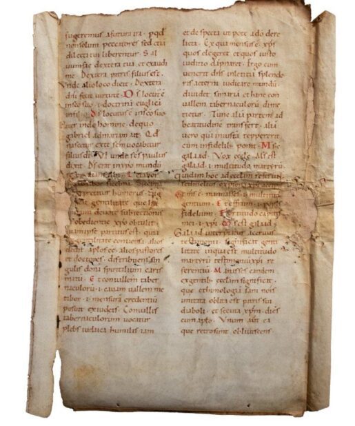
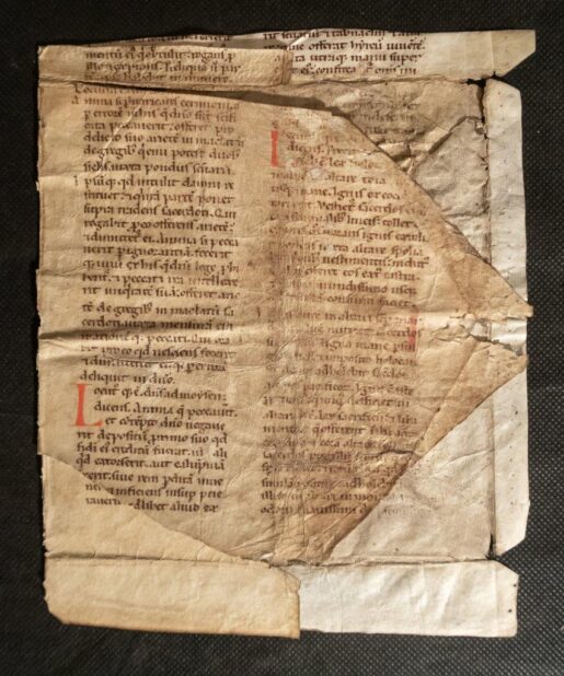
Leaf from an early Breviary or Passionale, with part of Paulinus of Milan’s Life of St Ambrose, in Latin [England, late 12th or early 13th century]
Physical description and Materiality
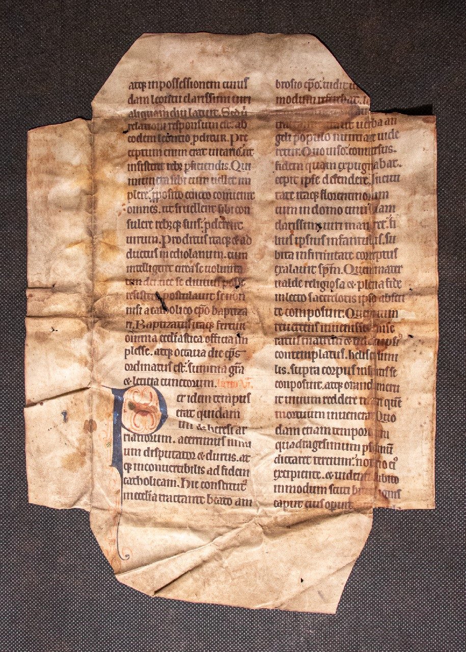
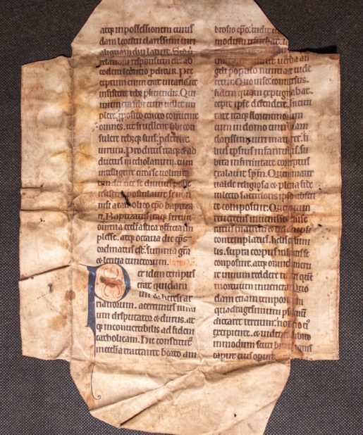
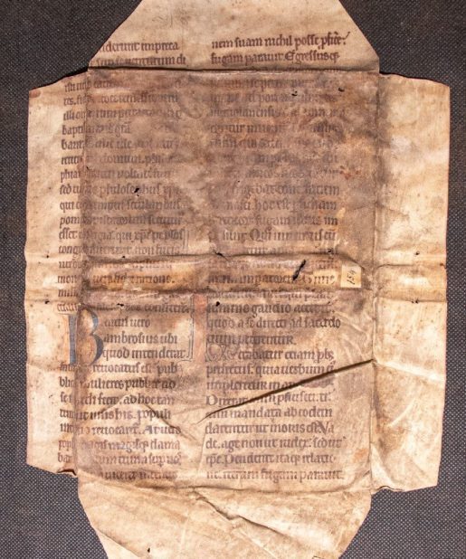
Parchment, a substantially complete leaf, c.350×250mm, the blank corners and a few words of text cropped but with wide margins, pricked in both side margins and ruled in plummet for two columns of 30 lines, written above top line in a very fine formal bookhand.
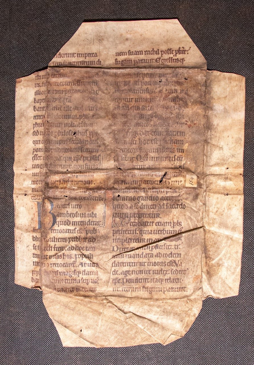
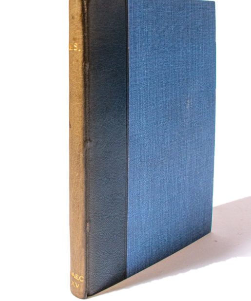
The four outer creases show that the parent volume was given very wide turn-ins (it would have involved unnecessary extra effort to trim the leaf down to a smaller size); the two horizontal creases across the middle, flanked by pairs of sewing-holes, represent the spine of the host volume, with no title, but with a paper label inscribed “154” at the foot. As so often, the outer face is far darker than the inner, but the inner face shows how some liquid staining was guided along the channels created by the folds.
The pricking in the inner margin (as well as the outer) suggests that the book was ruled leaf-by-leaf, not bifolium-by-bifolium: this practice involved extra labour and was only common in the few decades before and after 1200 (N. R. Ker, Medieval Manuscripts in British Libraries, I: London (Oxford, 1969), p. ix: “Pricking is mentioned only if it occurs in the inner margin as well as the outer margin of each leaf, as is common of manuscripts of the late twelfth century and the early thirteenth century. This double pricking implies that the bifolium was folded before it was ruled”).
Script
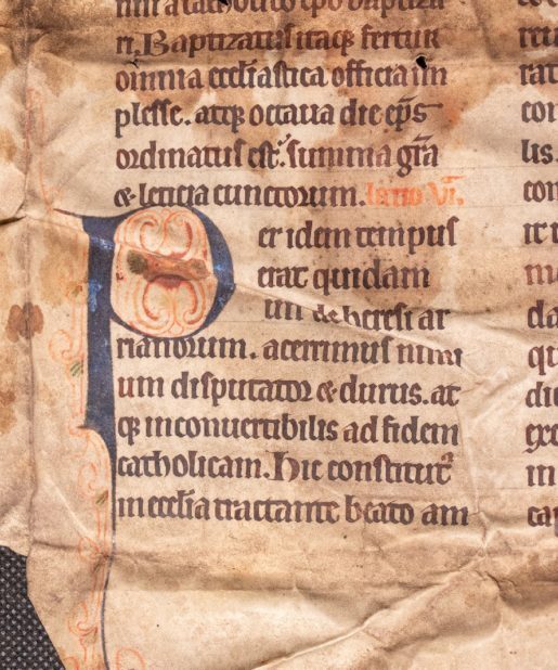
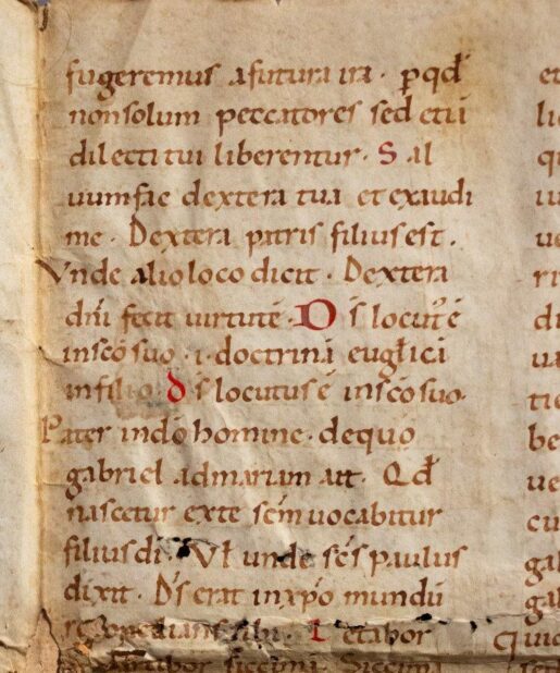
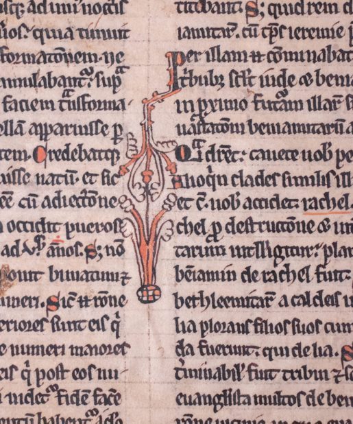
Written in a very regular and handsome high-grade expert English bookhand. Characteristic features are the very regular flat or lozenge-shaped feet to the minims, the majuscule form of ‘r’ at the end of words (e.g. “Proditur”), and sometimes within (e.g. “moris”), the ‘a’ that is somewhat trailing-headed, the fusing of double ‘p’, but not ‘po’, ‘od’, etc., round ‘r’ follows ‘o’, the ampersand appears but not tironian ‘et’, ‘g’ is very upright with a small lower bowl, ‘t’ has a serif rising from the left of its top-stroke, both upright and sloping ‘d’ are used, and round ‘s’ occurs often, but not always, at the end of words. The overall appearance is of the early 13th-century, but the lack of Gothic features such as fusing of letters, and the absence of tironian ‘et’, suggests an earlier date.
Text
Part of Lessons III–VI of the Matins readings for the feast of St Ambrose (7 December):
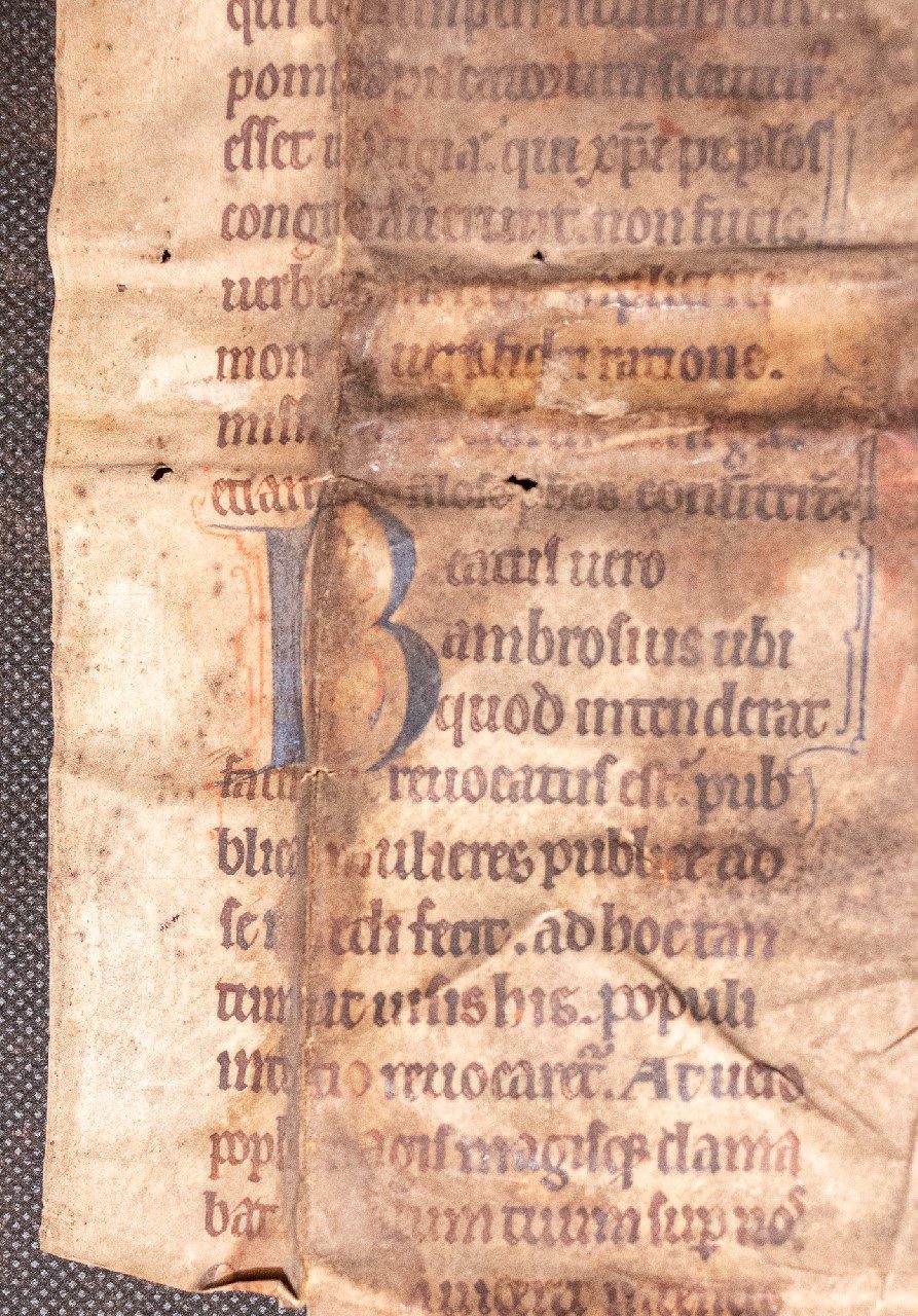
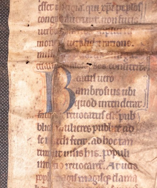
recto: “[…]derunt imprec[…] super se uenturum … etiam ipsos filosophos conuerterunt. Beatus uero Ambrosius ubi quod intenderat … ad sacerdotium peterentur. Letabatur etiam probet prefectus … iterum fugam parauit”
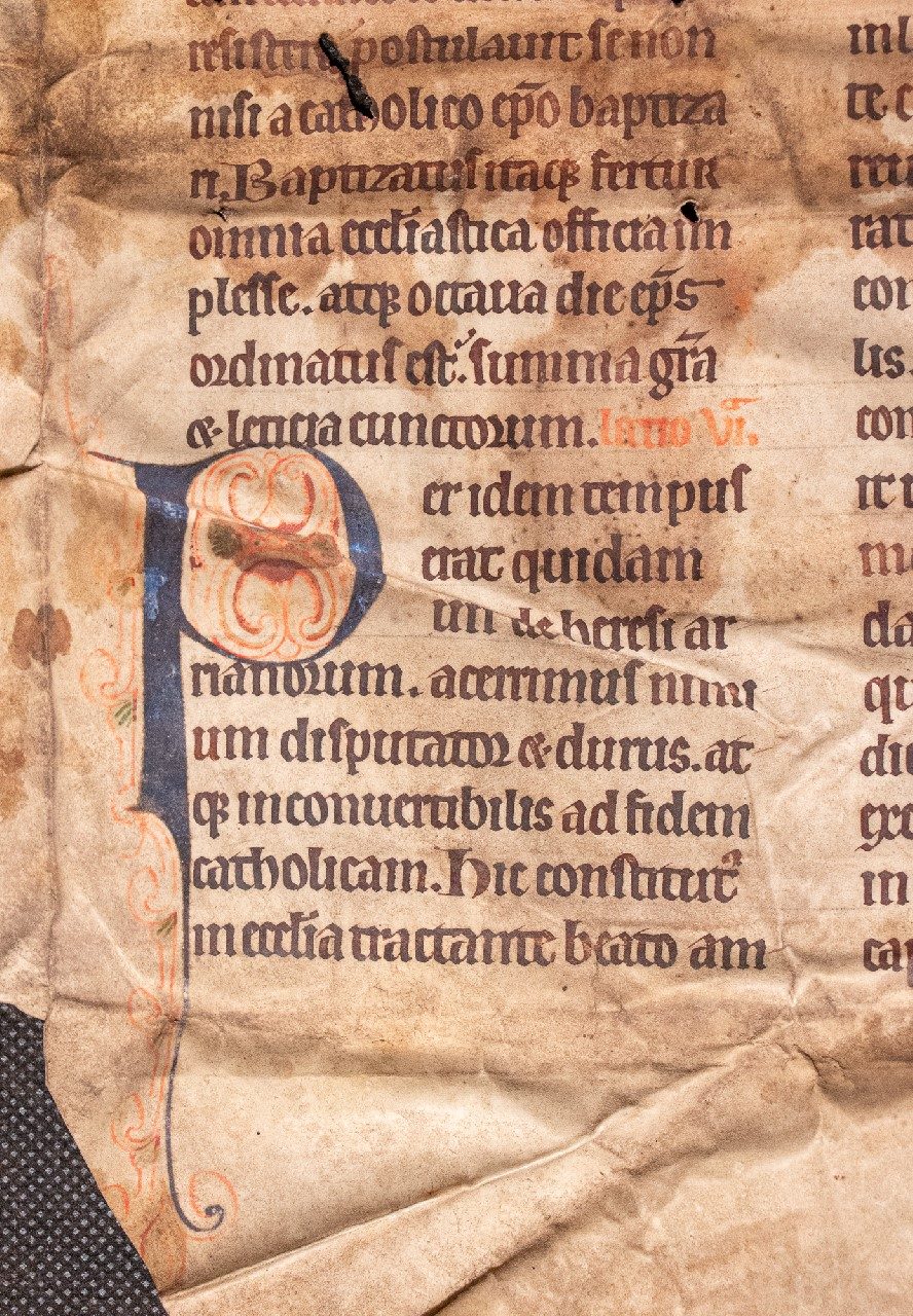
verso: “atque in possessionem cuiusdam Leontii … summa gratia & leticia cunctorum. Lectio VI. Per idem tempus erat quidam uir de heresi Arianorum … caput eius operuit atque [paulatim]”.
Decoration
The three readings each begin with a four-line initial, alternately red with blue penwork ornament or vice versa, with small touches of green; that on the verso used as the inner face of the book-cover and thus better preserved, its descender extending alongside five lines of text and an equal distance down into the lower margin.
Provenance
From a box of uncatalogued fragments at the library of the Benedictine abbey at Ampleforth, Yorkshire; deaccessioned in 2010. It is likely to have been removed from the binding of one of the Abbey’s printed books, bound in the 16th century.
Be the first to review “Elegant English Early Gothic Script from late C12th Passionale – Paulinus of Milan” Cancel reply
Product Enquiry
Related products
C12th - C13th manuscripts
Pseudo-Jerome (perhaps Augustine) Commentary on Psalm 59, Italy pre-1180
Illuminations
C12th - C13th manuscripts
C12th - C13th manuscripts
Miniature Breviary leaf with unusual and handsome script, c.1280
C14th -C16th manuscripts
C12th - C13th manuscripts
C14th -C16th manuscripts
‘Exquisite Roman hand’; a humanist Psalter c.1460 by Pietro Ursuleo of Capuo in Latin.
C12th - C13th manuscripts



![The Annunciation to Zechariah, on a bifolium from an Antiphonary, in Latin [Germany or Austria, (mid-?)15th century] The Annunciation to Zechariah, on a bifolium from an Antiphonary, in Latin [Germany or Austria, (mid-?)15th century]](https://butlerrarebooks.co.uk/wp-content/uploads/2021/04/IMG_0977-515x618.jpg)
![The Annunciation to Zechariah, on a bifolium from an Antiphonary, in Latin [Germany or Austria, (mid-?)15th century] The Annunciation to Zechariah, on a bifolium from an Antiphonary, in Latin [Germany or Austria, (mid-?)15th century]](https://butlerrarebooks.co.uk/wp-content/uploads/2021/04/IMG_0769-515x618.jpg)
![St James Preaching in an historiated initial on a leaf from a Bible in Latin [Paris, late 13th or early 14th century] St James Preaching in an historiated initial on a leaf from a Bible in Latin [Paris, late 13th or early 14th century]](https://butlerrarebooks.co.uk/wp-content/uploads/2022/02/IMG_2254-2-515x618.jpg)
Reviews
There are no reviews yet.